Ziptility
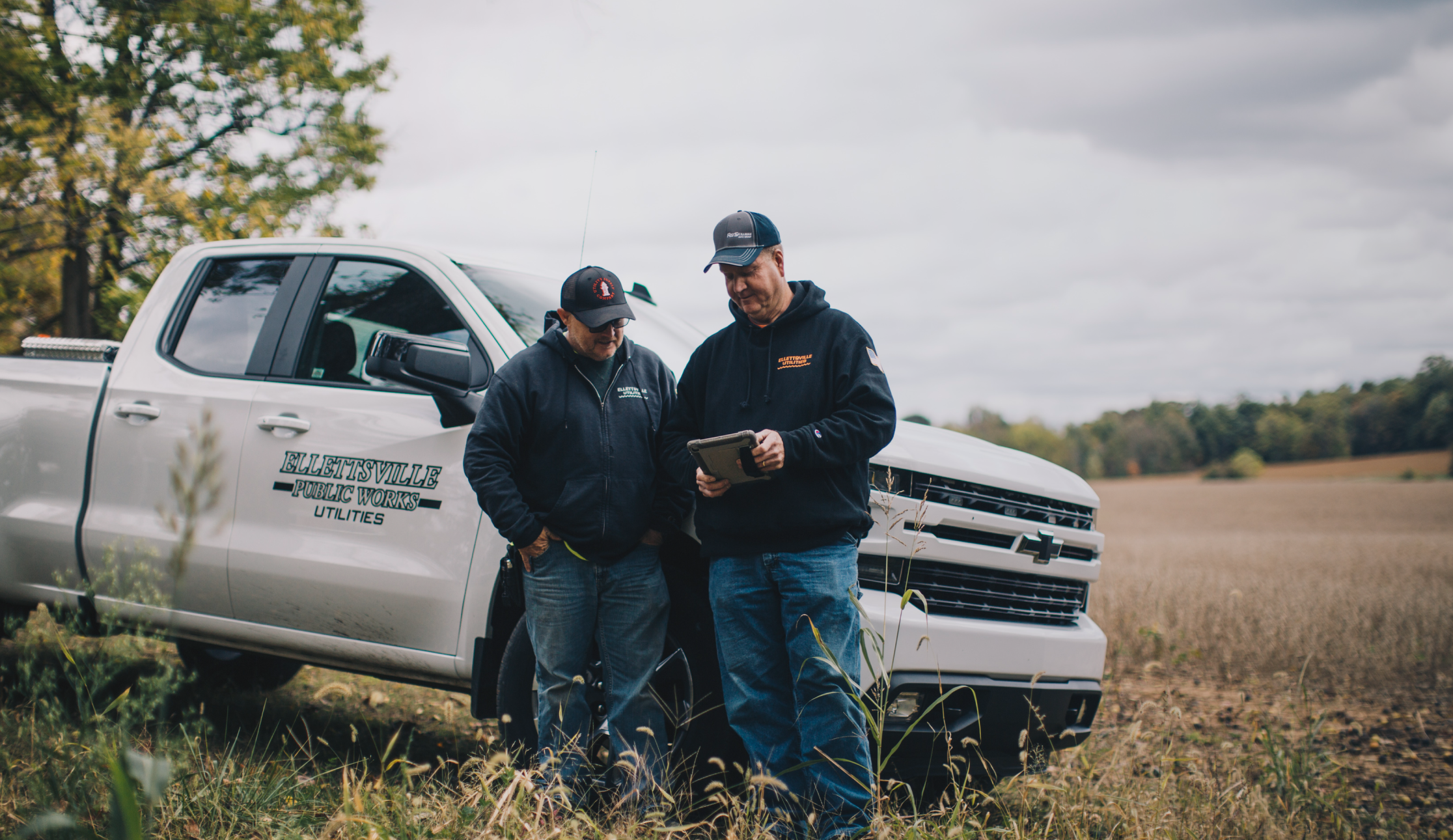
Reimagining a utility management platform used by small field teams and administrators. Ziptility needed workflows that stayed fast in the field while supporting operational oversight. I led design across web and mobile to focus on clarity, speed, and a system that could grow with the product.
⌙ Product Design, Design Systems
⌙ Web, Mobile
Quick & Easy
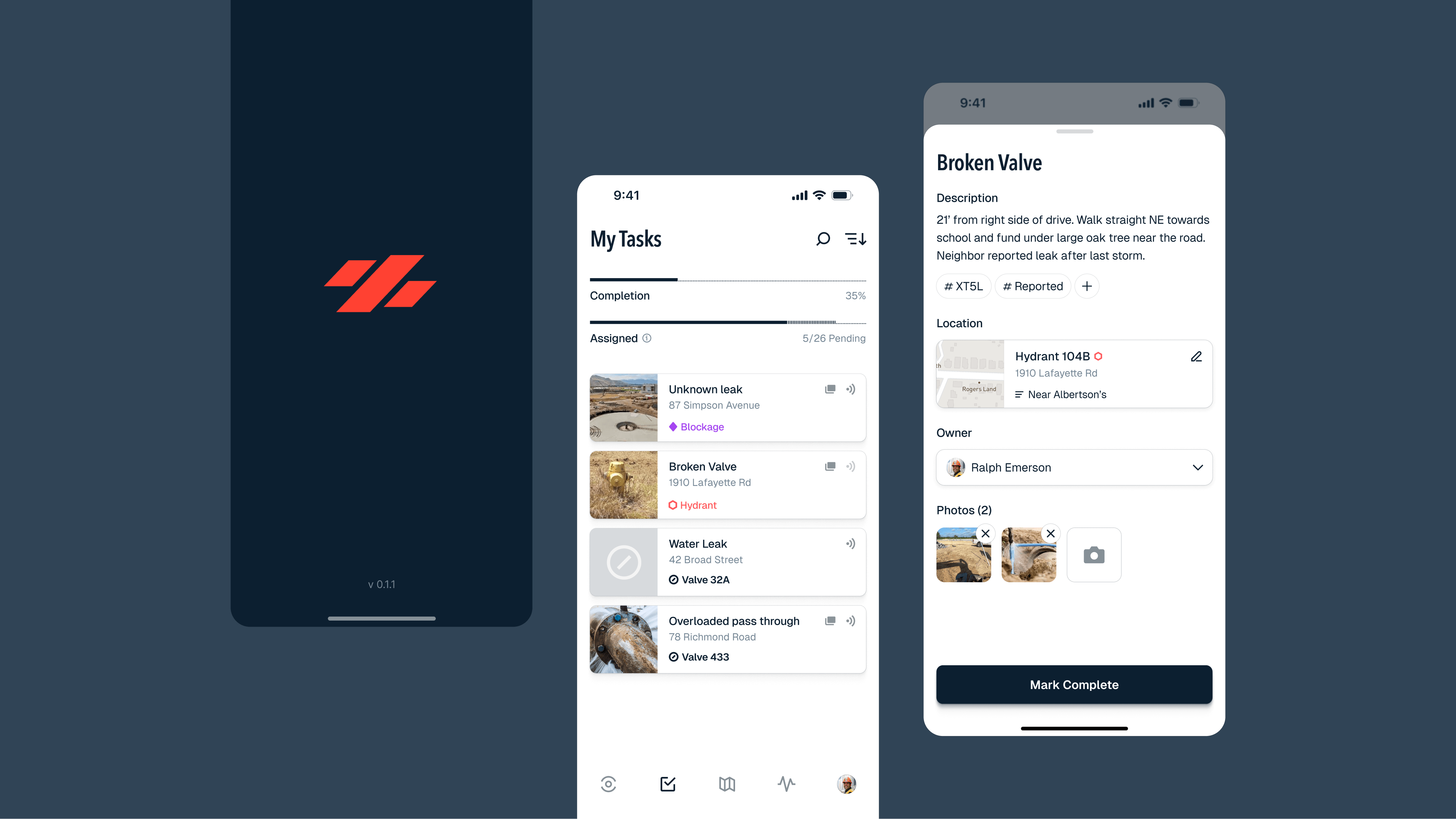
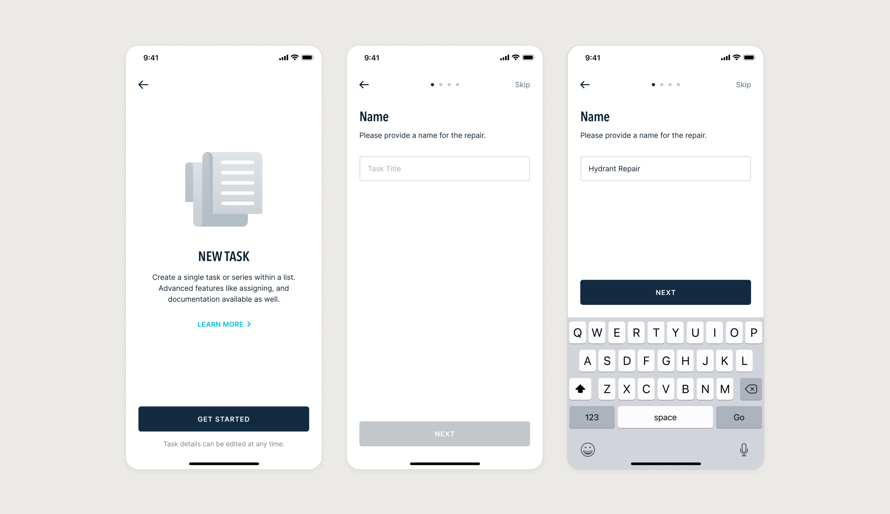
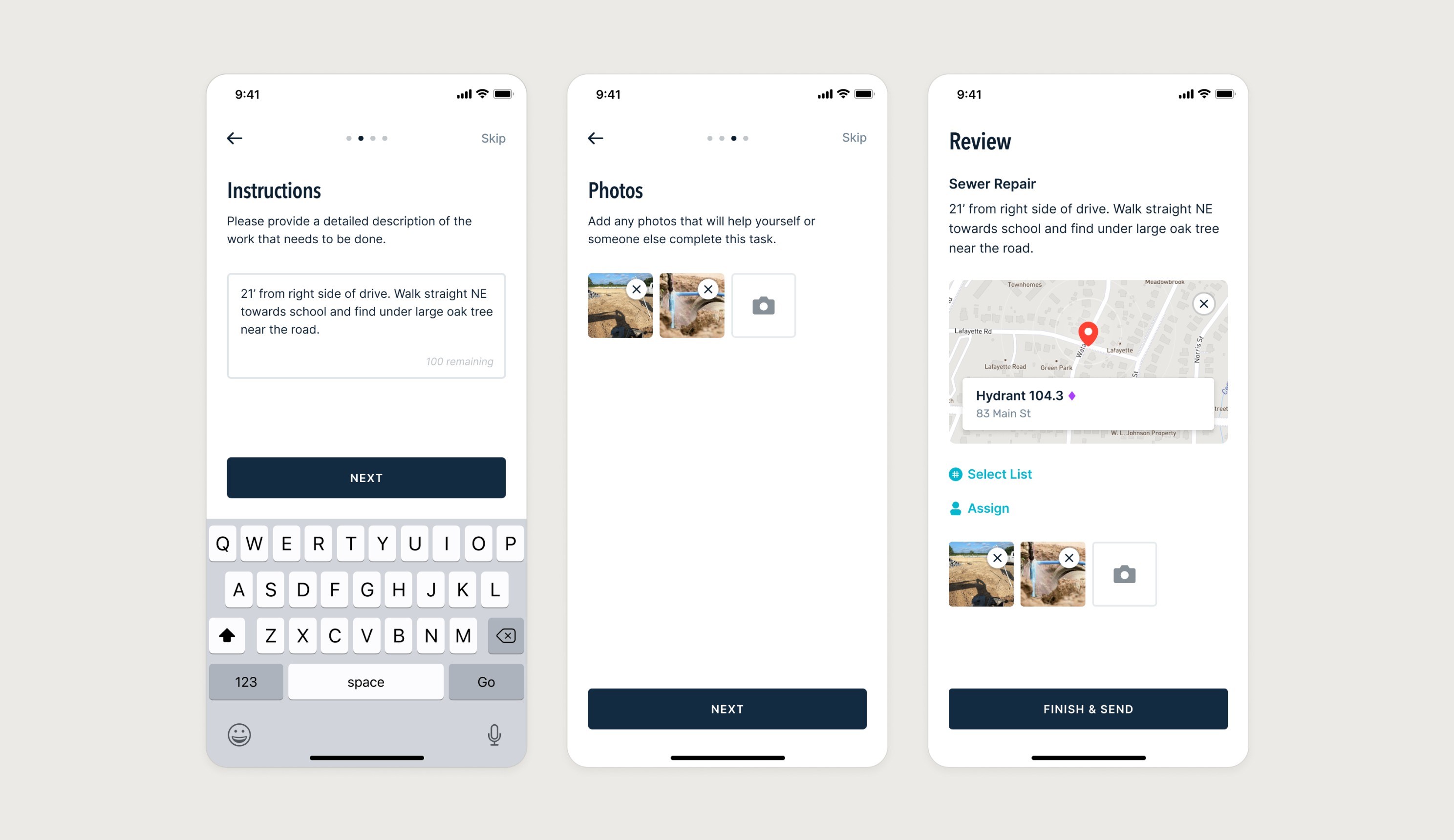
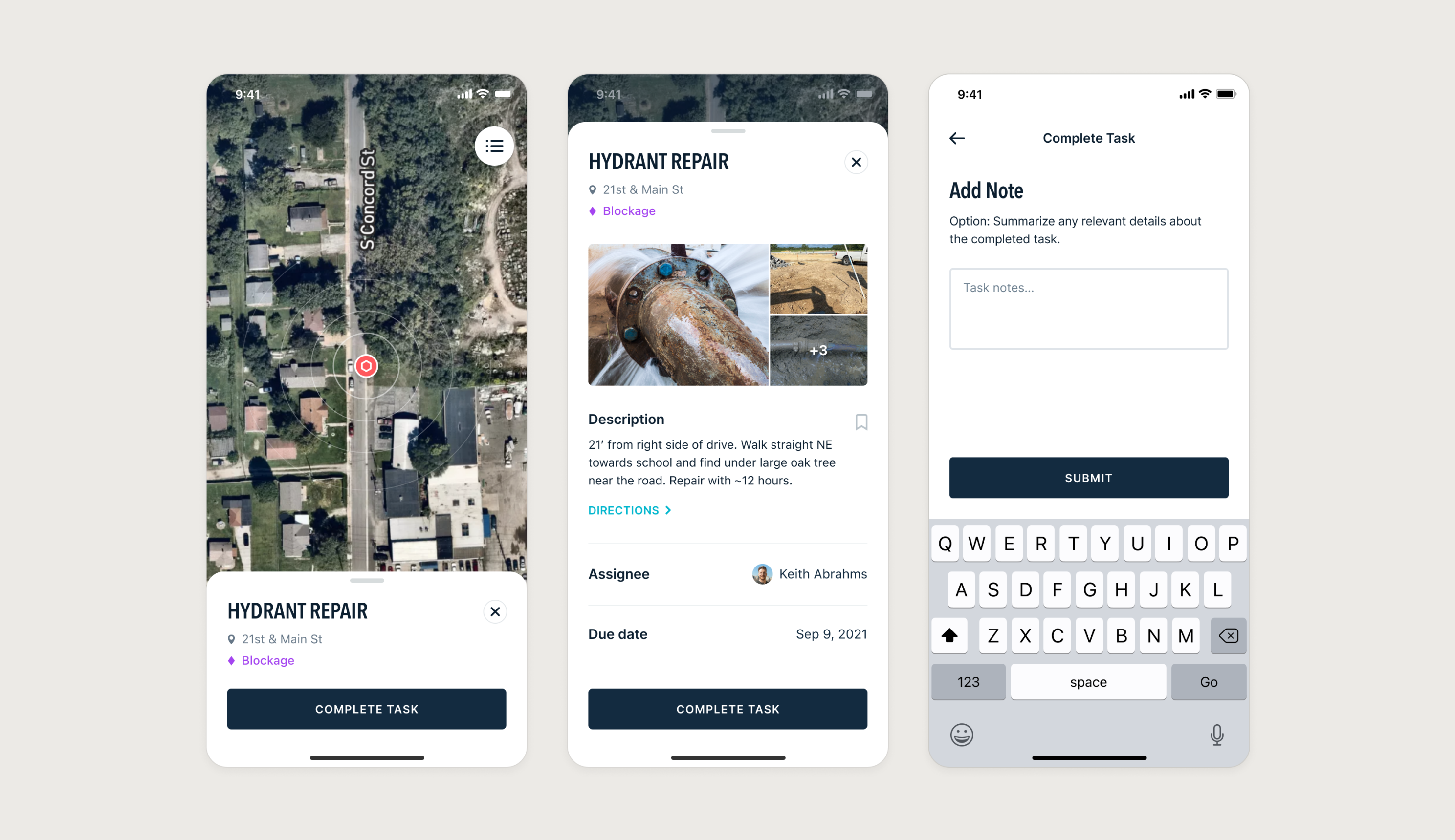
Utility work is rarely quick or easy. Task creation emerged as a key flow needing particular focus — especially for field workers and managers. The resulting process allowed detailed requests to be added to a queue while keeping workers engaged and productive.
Design at Scale
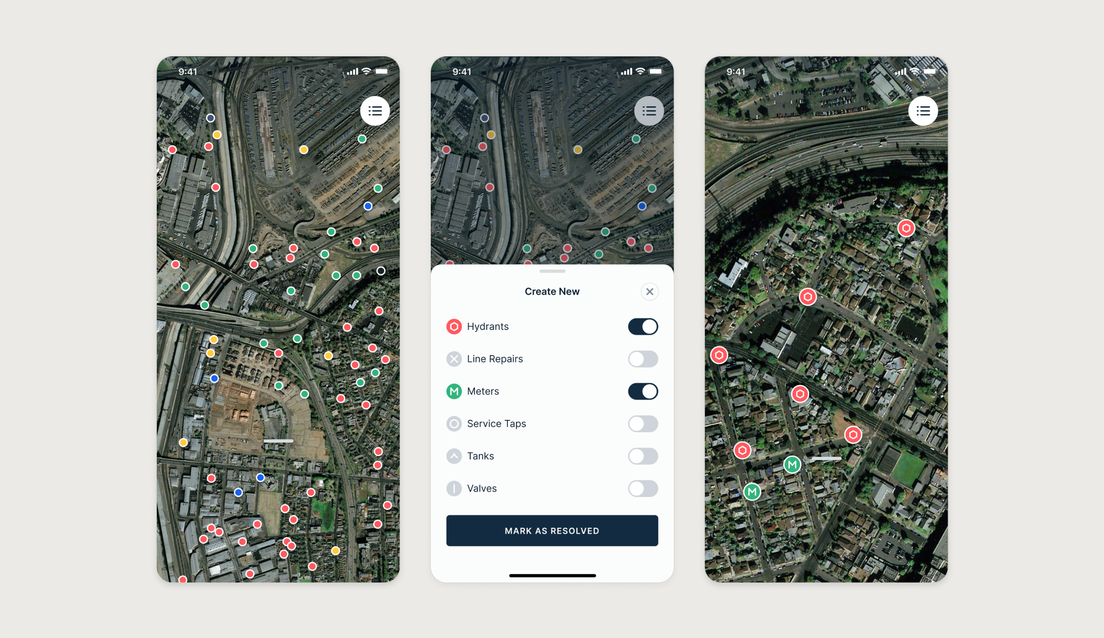
At the start of the engagement, one priority rose above the rest: a scalable design system for both web and mobile. While redesigning both surfaces, I defined and built a system that supported current product needs and future growth.
Administrative
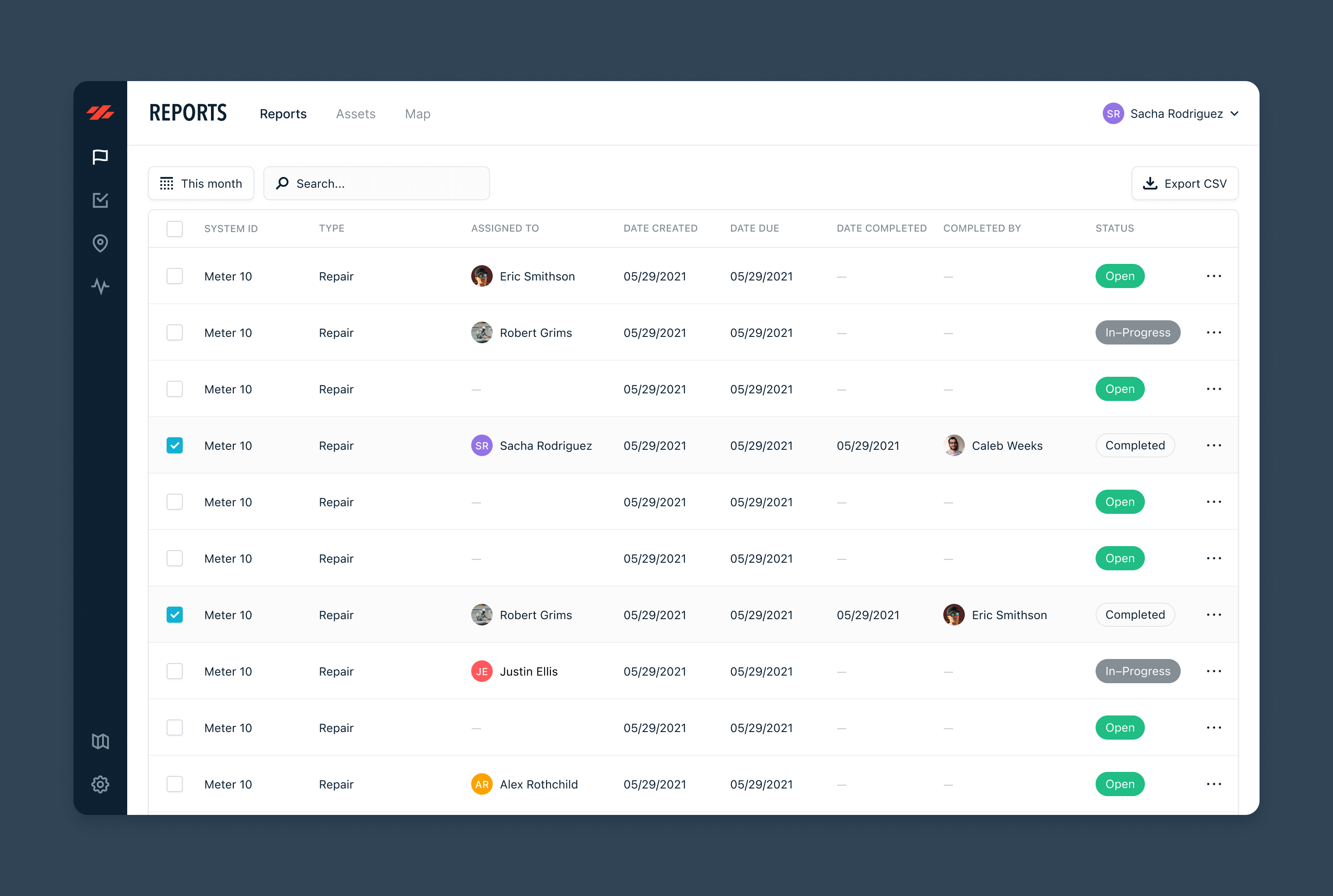
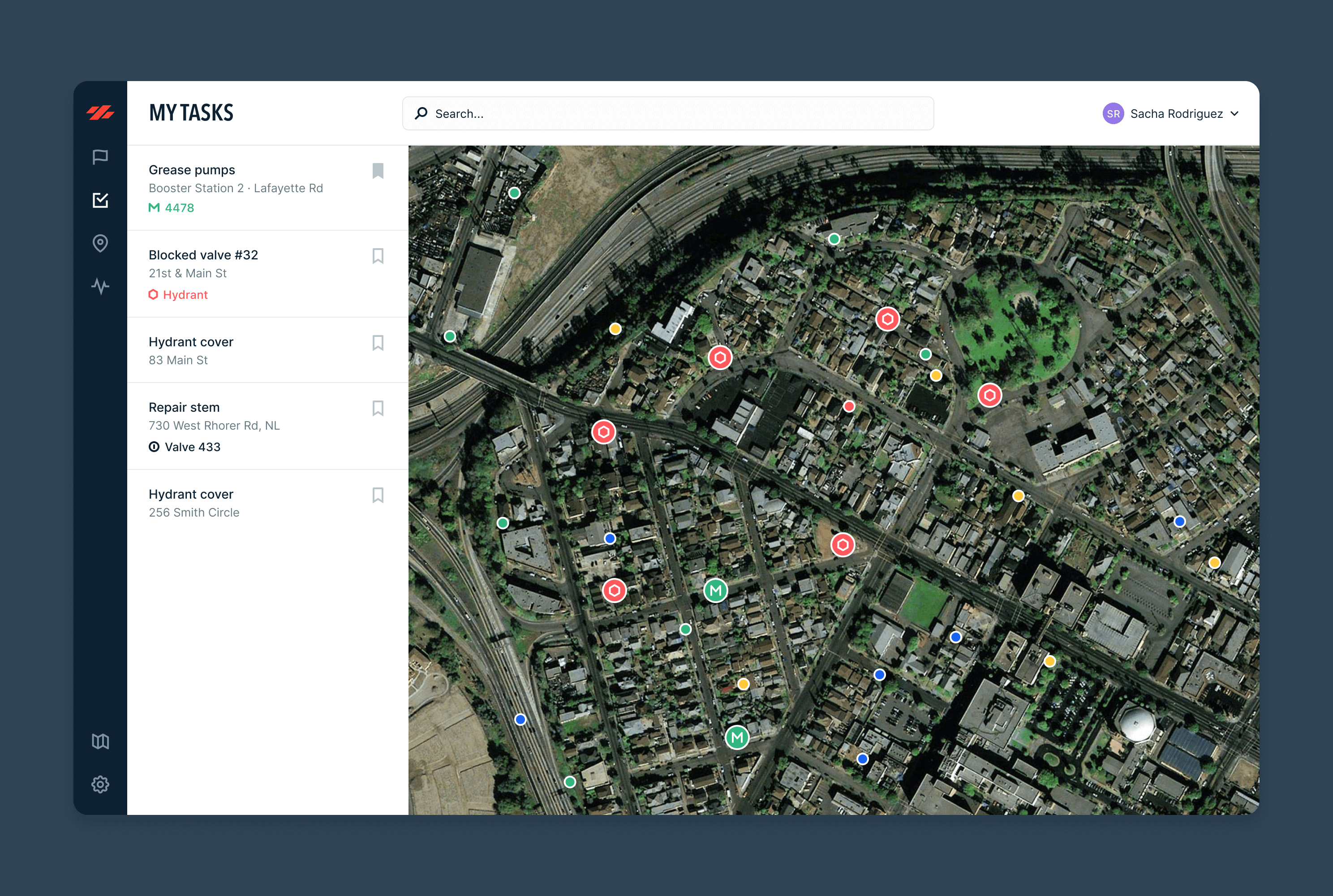
An admin portal was designed to give administrators access to reports, assets, and city maps. These dashboards came together efficiently thanks to the underlying system, adding meaningful usability and oversight value to Ziptility’s core product.
Takeaway
Reimagining Ziptility’s product from the ground up delivered a scalable design system that supports both web and mobile experiences. By focusing on core workflows and a unified system, internal teams were empowered to iterate faster, streamline administrative oversight, and improve field workflows across utility operations.
